
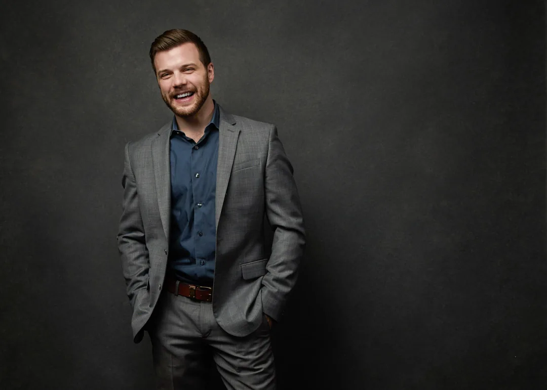
Wondering what background is best for a professional headshot? Here are six proven options and the exact message each one sends.
There is no single best background for a professional headshot. The right one depends on your industry and how you want to come across, so the honest answer is that a neutral gray is the safest default, while a brighter or darker choice can serve you better depending on the impression you need to make. The background is a supporting actor, not the star, and its whole job is to frame your face in the right mood. If you would rather have that decision made for you on the day, a guided session at JA Headshots in Fort Myers includes choosing the backdrop together based on where your photo will be used.
I'm Joshua Albanese, and I've photographed more than 15,000 professionals over 18 years, first in Chicago and now here in Southwest Florida. In almost every session someone asks me which background is "correct," as if there is one right answer they are supposed to already know. There isn't. There are six backgrounds I return to again and again, and each one sends a slightly different message. Here is what each looks like, what it signals, and who it tends to suit.
1. Neutral gray: the trusted default
A neutral mid-gray is a seamless, evenly lit backdrop that sits somewhere between light and dark, with no texture competing for attention. It is the most versatile background I own, and it is the one I reach for when a client isn't sure what they want.
What it signals is steadiness. Gray says professional, timeless, and considered without shouting any of it, because it keeps every bit of attention on your face and expression. It never dates, it never distracts, and it pairs cleanly with almost any wardrobe color.
It suits nearly everyone, but it is especially strong for attorneys, financial advisors, executives, and anyone building a LinkedIn presence that needs to read as reliable. If you only ever get one headshot and want it to work everywhere, gray is the choice that will not let you down.
2. Bright white: modern and approachable
A bright white, or high-key, background is clean and luminous, with the light wrapped around you so there is little to no shadow behind your shoulders. It feels open and current, the visual equivalent of a well-lit modern office.
What it signals is approachability and freshness. White reads as optimistic, transparent, and easy to work with, which is exactly the tone a lot of forward-looking brands want. It also drops cleanly onto a website or a slide, since the edges blend into a white page.
It suits tech professionals, startup founders, healthcare providers, and real estate agents who want to feel current rather than corporate. Here in Fort Myers, agents often ask for a crisp white background because it sits beautifully on a listing brochure or a bright, contemporary website. If your brand leans clean and modern, white is your backdrop.
3. Dark charcoal: authority and gravitas
A dark background runs from deep charcoal to near-black, with light shaped to fall off gently behind you. It is the most dramatic of the six, and it adds visible weight to a portrait.
What it signals is authority. The depth and shadow read as confidence, seniority, and a certain premium quality, so a dark background quietly tells people you are established. It is the look you see on the covers of business books and on the leadership pages of respected firms.
It suits executives, senior attorneys, consultants, speakers, and authors, anyone whose work depends on being taken seriously the moment their photo loads. A word of honesty: it can tip into feeling stern for a warm, people-first brand, so I only recommend it when gravitas is genuinely the goal. When it is, nothing else carries the same command.
4. Soft environmental blur: grounded and in your element
An environmental background is your actual workplace or a relevant setting, photographed and softly blurred so the context is present without stealing focus. Think a hint of an office, a workshop, or a bright interior dissolving gently behind you.
What it signals is that you are grounded and in your element. This background says hardworking and relatable, because it places you in the real world rather than against a blank studio wall. The soft blur keeps it professional while the setting adds a layer of story.
It suits business owners, contractors, medical providers photographed in their practice, and realtors who want to show their local roots. I shoot these on location around Southwest Florida when a client wants their photo to feel connected to the community they serve. If your brand is built on being present and hands-on, this is the background that shows it.
5. On-brand color: intentional and cohesive
An on-brand color background is a solid backdrop pulled directly from your company or personal brand palette. Not a random bright hue, but the specific color your audience already associates with you.
What it signals is intention. A branded color reads as polished, marketing-savvy, and memorable, and it makes a whole team's headshots feel like one cohesive set when everyone shares the same backdrop. It is a small detail that quietly tells people you think about how you show up.
It suits agencies, marketers, personal brands, and any company that wants a matched grid of team photos on their about page. The one rule I hold firm on is that the color has to flatter skin tones, so we test it under studio light before committing. Done with restraint, an on-brand color is one of the most distinctive choices you can make.
6. Outdoor natural light: warm and human
An outdoor background uses real daylight, with greenery, architecture, or open space softly out of focus behind you. It is the warmest and most human of the six, and it trades the control of a studio for a sense of life and air.
What it signals is warmth and energy. An outdoor portrait reads as approachable, genuine, and comfortable in your own skin, which is why it works so well for people whose relationships are personal. It never feels stiff.
It suits coaches, wellness professionals, hospitality, creatives, and real estate agents who want their photo to feel like a real person you would enjoy meeting. Southwest Florida light is a genuine advantage here, since the soft early and late light and the natural greenery give us a backdrop most studios have to fake. If your work is about connection, the outdoors is on your side.
How to actually choose
Start with two questions: what does your industry expect, and how do you want people to feel when your photo loads? Gray and white cover most professionals safely, dark adds authority, environmental and outdoor add humanity, and an on-brand color adds polish for a team. If you are still unsure, that is exactly the kind of decision I make with clients at the start of a session, based on where the images will actually live. A session is $500 and includes the studio time to try more than one look, with retouched images at $150 each, so you are not locked into a single guess. If you want to talk it through before you book, reach out through the contact page and tell me where your headshot needs to work.
The questions I hear most about choosing a headshot background, answered in plain language.
Ready to get a headshot on the right background?
You do not need to know the answer before you arrive. If you're ready to get it done right, explore guided headshot sessions with JA Headshots in Fort Myers, where we choose your background together based on your industry and where the photo will live. Sessions are directed start to finish, retouching is included, and there's no clock on your time. Call (239) 401-6999 to book.
This article was written by Joshua Albanese, founder and lead photographer at JA Headshots in Fort Myers. He founded a top-10 US headshot studio in Chicago, photographed more than 15,000 professionals over 18 years, and relocated to Southwest Florida in 2024. His psychology-driven approach is built for people who are convinced they are not photogenic.
Frequently asked questions
What background is best for a professional headshot?
There is no single best background. The right one depends on your industry and the impression you want to make. A neutral mid-gray is the safest default because it keeps every bit of attention on your face and works across almost any profession, which is why it is the one I reach for most often. If you want to feel modern and approachable, a bright white works well. If you want authority and gravitas, go darker. The background is a supporting choice, so pick the one that matches how your clients need to see you.
Is a gray or white background better for a headshot?
Both are excellent, and the difference is tone. Gray is neutral and timeless, so it reads as steady and professional without saying anything loud. White is clean, bright, and modern, so it reads as open and approachable. Gray suits attorneys, finance, and executives who want a classic look. White suits tech, healthcare, real estate, and anyone whose brand leans fresh and current. Neither is wrong. Choose the mood you want your face framed by.
Does a dark background look more professional?
A dark or charcoal background does not look more professional, but it does look more authoritative. The deep tone adds weight and drama, which reads as confidence and seniority. That makes it a strong choice for executives, attorneys, consultants, speakers, and authors who want their headshot to carry gravitas. For a warm, approachable brand it can feel too serious, so match the background to the impression you actually want, not to a rule about what looks most professional.
Can I use a colored background for a corporate headshot?
Yes, when the color is pulled from your brand palette and used with restraint. A solid, on-brand color reads as intentional and memorable, and it makes a team grid feel cohesive when everyone shares the same backdrop. The key is choosing a shade that flatters skin tones rather than fighting them, which is why we test it under studio light before committing. Loud or trendy colors date quickly, so a considered brand color beats a bold one almost every time.
Are outdoor headshots professional enough for LinkedIn?
Absolutely, as long as the light and framing are handled well. An outdoor headshot with soft natural light and a gently blurred background reads as warm and human, which suits coaches, wellness professionals, hospitality, and creatives. Southwest Florida light is a genuine asset here, so a well-shot outdoor portrait can look every bit as polished as a studio frame. The difference between casual and professional is craft, not location.
Not sure which background fits your industry? Book a guided headshot session at JA Headshots in Fort Myers and we'll choose it together.
Learn more
Written by
Joshua Albanese
Photographer, JA Headshots
Joshua Albanese founded one of the top-10 rated headshot studios in the United States in Chicago in 2007. Over 18 years he photographed more than 15,000 professionals and produced over 3 million images for clients ranging from Fortune 500 executives to first-year associates. In 2024 he relocated to Fort Myers and opened a dedicated portrait studio at 1325 Canterbury Dr. His psychology-driven approach is built for people who say they aren't photogenic.