
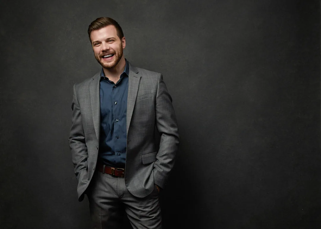
Wondering what to wear? Here are the six best colors for a headshot, the ones to skip, and why the difference shows up on camera.
The best color to wear for a headshot is a solid, mid-tone shade that flatters your skin and keeps every bit of attention on your face, and for most people that means navy blue. Navy, soft blue, charcoal gray, deep green, muted burgundy, and warm earth tones are the most flattering colors under studio light, while pure white, dead black, and busy patterns are the ones to skip. I'm Joshua Albanese, founder and lead photographer at JA Headshots in Fort Myers, and after photographing more than 15,000 professionals over 18 years I can tell you the color you wear does more quiet work than almost any other wardrobe choice. Here are the six colors I reach for first, why they work, and what to leave in the closet.
1. Navy blue, the color that flatters almost everyone
Navy blue is the single most reliable color you can wear for a headshot, because it is deep enough to feel professional and muted enough to keep the focus on your face. It reads as steady and trustworthy without trying hard, which is exactly the impression a good headshot is built to make.
What makes navy so dependable is that it sits right in the mid-tone range that studio light loves. It does not blow out the way white does, and it does not swallow shadow detail the way black does, so your shoulders and jawline stay clearly defined. It also plays well with nearly every skin tone, which is rare. If you are shooting a portrait for LinkedIn, a law firm bio, or a corporate directory and you only want to think about this once, navy is the answer. It is the color I recommend more than any other in the studio here in Fort Myers.
2. Charcoal gray, the authority of black without the trouble
Charcoal gray gives you the serious, grounded feel that people reach for when they choose black, but without the problems black creates on camera. It is a dark, neutral tone that holds its shape and keeps every fold and shoulder line readable.
Here is the mechanism most people never think about. Dead black absorbs so much light that the camera loses the edges of your body, and you can end up looking like a floating head with no shoulders. Charcoal keeps just enough tonal detail that your frame stays intact, so you get the same authority with none of the visual collapse. It is a favorite for finance, legal, and executive portraits, and it pairs cleanly with almost any shirt or blouse underneath. When someone tells me they always wear black, charcoal is the first place I move them, and they almost never miss the black.
3. Soft blue, the approachable, open choice
Soft blue, meaning a powder or light-blue tone rather than a bright one, is the color to wear when you want to look approachable rather than severe. Where navy signals authority, soft blue signals warmth and openness, so it is a natural fit for anyone whose work depends on people feeling comfortable with them.
That difference matters more than it sounds. A financial advisor, a therapist, a real estate agent, or anyone in a service role often wants a portrait that says "you can talk to me," and color carries a real part of that message before anyone reads a single word. Soft blue stays light without going pure white, so it keeps attention on your face while adding a friendly, easy feel to the whole frame. It is one of the most underused flattering colors I see, and it suits cooler skin tones especially well.
4. Deep green, the modern color that stands out tastefully
Deep green, whether that is forest, emerald, or a muted olive, is the color to choose when you want your headshot to stand out a little without looking loud. It has become one of the most popular alternatives to navy, and for good reason. It feels current and distinctive while still reading as professional.
Green works because it is a rich, saturated tone that complements both warm and cool skin, and it does not compete with your face the way a bright primary color would. Here in Southwest Florida, where so much of the natural backdrop is green, a deep green top reads as grounded and intentional rather than trendy. I see it work beautifully for creatives, founders, and anyone building a personal brand who wants their portrait to feel a bit more like them and a bit less like a corporate ID badge. The key is keeping it deep and muted rather than bright and grassy.
5. Muted burgundy, warmth and quiet confidence
Muted burgundy, along with wine and deep berry tones, brings warmth into your headshot and adds a note of confidence without shouting. It is the color that adds richness to your skin, which is why it photographs so flatteringly on so many people.
The important distinction is muted versus bright. A fire-engine or hot red vibrates on camera, casts a faint red glow onto your skin, and pulls the eye straight to your shirt. Burgundy solves all of that by keeping the depth and warmth of red while dropping the intensity. The result is a color that feels sophisticated and a little bold at the same time. It suits warmer skin tones especially well, and it is a strong choice for personal branding portraits where you want a touch of personality that still looks polished and intentional.
6. Warm earth tones, camel, taupe, and olive
Warm earth tones, meaning camel, taupe, soft brown, and olive, are the colors to wear when you want a natural, relatable, human feel rather than a formal corporate one. They flatter warm skin tones in particular, and they photograph as calm and approachable under studio light.
Earth tones connect the whole portrait to a softer, more personal mood, which is why they work so well for creatives, real estate agents, wellness professionals, and anyone whose brand is built on being genuine and easy to trust. They pair naturally with the warm light I use in the studio, and they never fight your face for attention. If navy and charcoal feel too buttoned-up for the impression you want to make, earth tones are the friendlier end of the same reliable, solid-color rule. Bring a couple of shades, because the exact one that flatters you is easier to see on camera than in a mirror.
What to skip: the colors that fight your face
The colors to skip in a headshot are pure white, dead black, neon or electric brights, and any tight, busy pattern. Each one breaks the same rule in a different way, so it is worth understanding why rather than just memorizing the list.
- Pure white pulls light and attention toward your shirt and can blow out under studio strobes, so your face loses the spotlight.
- Dead black absorbs so much light that your shoulders can disappear, leaving a floating-head look.
- Neon and electric brights cast their own color onto your skin and neck, and they distract from your expression.
- Tight patterns, like thin stripes and small checks, can shimmer or buzz on camera, and logos do the same, pulling the eye off your face.
None of this means you have to dress like everyone else. It just means the clothing's only job is to stay quiet so you come across clearly. Solid, mid-tone, and simple wins almost every time.
The questions I hear most about choosing headshot colors, answered in plain language.
Ready for a headshot in a color that actually flatters you?
You do not have to guess at this alone. When you book a guided studio session at JA Headshots in Fort Myers, wardrobe and color coaching are part of the process, so we test your options under real studio light and choose the shades that make you look your best. Sessions are directed start to finish, the session fee is a flat $500, and each finished image is $150 with professional retouching included. If you are ready to get it done right, get in touch to book your session, and bring two or three colors on hangers so we can find your best one together.
This article was written by Joshua Albanese, founder and lead photographer at JA Headshots in Fort Myers. He founded a top-10 US headshot studio in Chicago, photographed more than 15,000 professionals over 18 years, and relocated to Southwest Florida in 2024. His psychology-driven approach is built for people who are convinced they are not photogenic.
Frequently asked questions
What is the best color to wear for a headshot?
The best color is a solid, mid-tone shade that flatters your skin and keeps attention on your face, and for most people that is navy blue. Navy, soft blue, and charcoal gray are the safest choices because they photograph cleanly under studio light and suit almost every skin tone. If you want a little more personality, deep green, muted burgundy, and warm earth tones all read well too. The rule underneath all of them is the same: choose a solid color in a fit that skims your frame, and let it stay quiet so your face does the talking.
Can I wear black or white in a headshot?
You can, but both make the photographer work harder and rarely help you. Pure white pulls light and attention toward your shirt and away from your face, and it can blow out under studio strobes. Dead black swallows light and detail, which sometimes leaves your head looking like it is floating with no shoulders underneath. If you love those tones, meet them in the middle: a soft gray instead of black, or a light blue or cream instead of stark white. You keep the clean, classic feel without the problems.
What colors should you avoid in a professional headshot?
Avoid pure white, dead black, neon or electric brights, and tight patterns like thin stripes and small checks. Bright colors can cast their own tone onto your skin, so a hot red or lime green shirt can leave a faint colored glow on your face and neck. Tight patterns can shimmer or buzz on camera, which pulls the eye off your expression. Logos do the same thing. The safest path is a solid, mid-tone color with no busy detail competing for attention.
Does the best headshot color depend on skin tone?
It helps to think about it, but you do not need to overthink it. Cooler skin tones tend to look great in navy, charcoal, and soft blue, while warmer skin tones come alive in earth tones, olive, and burgundy. That said, navy and charcoal are close to universal, which is why I recommend them so often. The most reliable move is to bring two or three options on hangers so we can see what actually works on you under studio light, rather than guessing at home in the mirror.
Guided studio headshots in Fort Myers, with wardrobe and color coaching built into every session. Direction included, no clock.
Learn more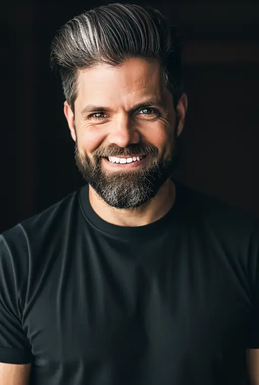
Written by
Joshua Albanese
Photographer, JA Headshots
Joshua Albanese founded one of the top-10 rated headshot studios in the United States in Chicago in 2007. Over 18 years he photographed more than 15,000 professionals and produced over 3 million images for clients ranging from Fortune 500 executives to first-year associates. In 2024 he relocated to Fort Myers and opened a dedicated portrait studio at 1325 Canterbury Dr. His psychology-driven approach is built for people who say they aren't photogenic.